1. Bauhaus - (1919-1933) The
first Bauhaus school was founded in Germany in 1919 by Walter Gropius. Bauhaus
consisted of fine arts elements and design education. Students following the
Bauhaus theory " entered specialized workshops, which included
metalworking, cabinetmaking, weaving, pottery, typography, and wall painting."(
The Metropolitan Museum of Art, 2000-2013) This school was found in
three cities; Weimar, Dessau and Berlin. (Each built respectively)
 |
| Bauhaus school of Art - Germany |
 2. Clay Bullae - (8000-3100 B.C.E Mesopotamia)
When
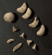
civilizations evolved and society started trading goods, it was important to
find a way to record transactions. Therefore small clay tokens were customized
into various shapes to represent objects (mostly grain, sheep and oil).
These
clay tokens were stored in "ball-shaped envelopes, bullae, which were
impressed on the outside with the shapes of the tokens found within. " (Designhistory,
2011)
This was not a writing system but an accounting method. Afterwards,
civilizations felt the need for writing - "graphically recording spoken
language. " (Designhistory, 2011)
Development
of Writing , 2014. Clay Bullae. [ONLINE] Available at: http://www.designhistory.org/Handwriting_pages/EarlyWriting.html. [Accessed 21 April 2014].
3. Cubism -
(Early twentieth century) This was one of the most influential
art styles and was created by Pablo Picasso and Georges Braque. Influences on
this style included Primitivism and non-Western sources. Cubist painters
reduced objects into geometric forms "cubes" and figures were
dissected into small facets. Landscapes were rare since "their favorite
motifs were still lifes with musical instruments, bottles, pitchers, glasses,
newspapers..." (The Metropolitan Museum of Art 2000 - 2013)
 |
| Violin and Playing Cards, 1913, Juan Gris |
4. Cursive - Cursive scripts were rapidly
written since the letters were joined together. In Arabic and Latin many
letters were connected with a single pen stroke. In Roman cursive, letters are
not connected like other versions of cursive.
 |
| Roman Cursive |
 |
| English cursive and cursive Arabic. |
 |
| DeStijl colours |
5. DeStijl - (1917-1931) This group 'The Style' created
ideal harmony to the destruction that was brought by war (WW1). The key figures
were Theo van Doesburg, Gerrit Rietveld and Piet Mondrian. This style was
simplistic and abstract, both in architecture and painting. Rules of the
Destijl also included asymmetric compositions and sans serif typography.
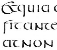
 6. English Half - Uncials
 - (Eighth century) This is a more slanted and
condensed version of the uncial writing. Irish and English uncials evolved to
the Carolingian Handwriting Reform.
7. Epigraphy
- The study of inscriptions/writing such as ancient handwriting, usually on
stone, metal or marble. For example the
Petroglyphs in Wadi Rum - Jordan (as shown in the picture). Epigraphy
can also be referred to as the early history of the alphabet. Since early
inscriptions were often nonprofessional, one can notice that they had irregular
cuttings but this changed by time.
Encyclopedia
Britannica, 2014. epigraphy [ONLINE] Available at: http://www.britannica.com/EBchecked/topic/189962/epigraphy/58798/The-use-of-inscriptions. [Accessed 12 February 2014].
8. Futhark - (200
CE - 1600 CE) The word 'Futhark' is composed from the first six letters of the
Runic alphabet. The word 'alphabet' itself is also composed from the first two
letters of the Greek alphabet; alpha, betha. The Runic alphabet consists of 24
letters, 18 consonants and 6 vowels as shown in the image.

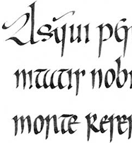
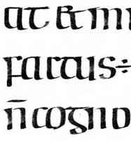
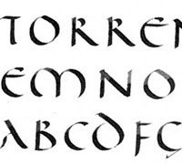
9. Half - Uncials - (Seventh - Ninth century) Unlike Roman
half-uncials, this type of writing wasn't as comfortable and standard. Half Uncials were written with a
horizontal pen nib. Christian missionaries imported the Irish Half Uncial into
Ireland. (An Irish variant example can be seen in the Book of Kells).
10. Impressionism
- (1874) Monet was one of the founders of Impressionism. It was the breaking
away from the traditional approach. Impressionism was also influenced by
Japanese woodblock. Since Paris was the centre of artistic activity, several
artists visited Paris to acquire knowledge of Impressionism.
 |
Post Impressionism Art Movement - Vincent Van Gogh
|
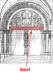
11. Lintel – This is the horizontal building component which supports
the tympanum. It is also found over windows and doors. Such example is the
Treasury of Atreus which is found in Greece. This is one of the largest lintels
in the world, weighing 120 tons.
 |
| West Portal of Autun Cathedral |
12. Neoplasticism - (The new plastic art) This art style was
named after Piet Mondrian who was a key figure in DeStijl. It was based upon
his personal thoughts through Cubism. Neoplasticism consisted of only lines and
rectangles which were arranged at right angles. The colours consisted of only
primary colours (red,blue,yellow), black and white.
 |
| Neoplasticism canvas prints |
13. Paleography - This
is the study of reading and analyzing ancient handwriting. It starts from
interpreting what someone has written at an earlier time. A paleographer must
know how to interpret punctuation and letter forms, and also various styles of
handwriting. Paleography is essential for historians since it reflects history
itself, this can be observed when reading manuscripts. This study can also be
used to indicate the movement and concern in earlier societies.
 |
Example of an old script: The Will of Henry Pilkington. 1619
|
|
14. Petroglyphs - Also referred to as rock carvings or
picture writing. These were carved or engraved by removing parts of a rock
surface. Petroglyphs are similar to petrographs but these were not carved; they
were painted on to rocks. Petroglyphs and Petrographs were both done by people
who lived in the prehistoric. It is thought that these carvings record
significant events such as births. Such
examples are the Petroglyphs of Hawaii Island. One can find various Hawaiian Petroglyphs scattered throughout the
island.
 |
| Petroglyphs of Hawaii Island |
|
Many of these petroglyphs are geometric patterns and
according to researchers there is a resemblance of different styles of
petroglyphs across different countries.
.jpg) |
| Nordic Bronze Age petroglyph that is carved into the Vitlyckehall stone in western Sweden. |
|
15. Pictographs and Ideographs - Also referred to as pictograms. These pictures
are used to display data. Pictographs are the first type of messages found in
history. Afterwards, ideographs were
developed which were more complex. These were symbols which represented data.
An example of an alphabet which is based on ideographs is the Chinese alphabet.
 |
| An early example of a pictograph |
|
Pictograms are still used nowadays. Such can be found in
train stations and airports. Some logos are also based on pictograms.
 |
| The Sochi 2014 Olympic Games pictogram |
|
16. Post Impressionism
- Mid-1880s to early 1900s. It was developed from Impressionism. This term
(Post Impressionism) was invented by Roger Fry who was an English artist and a
member of the Bloomsbury Group (a group of English writers/artists). Artists
such as Van Gogh, Cezanne and Gauguin sought new techniques for handling vibrant
colours.
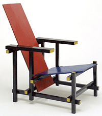
 17. Red Blue Chair
 - This was designed by Gerrit Rietveld in
1918. It was made of unstained wood and painted five years later with the 'Destijl
palette' - primary colours , black and white. This chair was considered for
mass production in standard sizes. Bright colours were added by the architect
Bart van der Leck. This chair was borrowed to the Deft University of Technology
when a fire destroyed the building but the chair was saved. Nowadays it is
found in Auckland, New Zealand.
18. Rococo - (also called 'Late Baroque') This style
originated in France around 1720 but it was soon adopted in Germany and Austria.
Characteristics of this style include: elegance, lightness and curving. The
style was asymmetrical while the predominant colours were ivory white and gold.
A room decorated in the
Rococo style, Nymphenburg palace, near Munich.
Rococo was then replaced by the Neoclassic style in the late
eighteenth century.
 19. Roman Uncials
 - (Fourth
century) Roman letters became more rounded and with less strokes therefore,
were written faster. This style was borrowed from the Greeks and named it
uncials (uncia - Roman inch in height). Even though this style changed and
evolved by time, the name still persisted and the Roman Half - Uncials was
later created.
 20. Roman Half-Uncials
 - (Sixth century) This style was much
easier and faster to write than the uncial style. It was "written between four
guidelines allowing for the development of ascenders and descenders."(Designhostory,
2011) Uncials and half uncials were also known as church letters and both
were used for designs within ceremonies or religious celebrations. In the next
centuries similar lettering was created (Half Uncials and English Half Uncials).
 21. Serif -
 This refers to the small
line which is attached to the end of a letter (shown in the picture). It all
started from the Egyptian hieroglyphs, which from it, originated the Phoenician
alphabet and later the Latin/Roman alphabet. There are various types of serifs
such as the Old Style (1465), Transitional Style (mid-18th century),
Modern(late 18th century) and Slab serif(1800). On the contrary a font without
serifs is called sans serif (sans in French means "without").
22. Spencerian script - (1850-1925) This type of script was used in the
United States and was the standard writing for businessman. It was developed by
Platt Rogers Spencer in 1840 and started being taught in schools. The
Spencerian script remained until the 1920's, since the typewriter started being
used for businesses, therefore this script became extinct.
 |
| Spencerian script example - 1884 |
 23. Times New Roman
 - This font got its name from the British newspaper
, the Times of London. The font was created in 1929 by Stanley Morison and
Victor Lardent (drew letterforms). Although Morison hired Lardent, they both
worked for the Times newspaper. The font
has a serif typeface and it was designed
for a newspaper which makes it narrower than most other fonts.
24. Tympanum – This refers
to the semi-circular arch which is situated over an entrance. A tympanum often contains imagery from Romanesque
and Gothic periods. Romanesque tympanums are more rounded while Gothic
tympanums have a more vertical shape and pointed at the top.
Personal thought: In this sculpture one can notice that the
main figure is in the middle while the less important are on the side. There
are also figures at the bottom which makes them even less important than the
rest. The middle figure is also larger compared to the others and has his arms
wide open to show that he is in control.
25. Volvelle - This medieval instrument was used to calculate the
motion of the Moon in relation to that of the sun. The first known Volvelle was
created by Matthew Paris(Benedictine Monk) in 1250 (shown in the picture). He
got inspired from the circular charts that appeared in the abbey's books. A
Volvelle consists of circular paper discs which function as a circular
calculator. These represent the dates of the phases of the Moon.
 |
| The First known Volvelle by Matthew Paris 1250 |
|